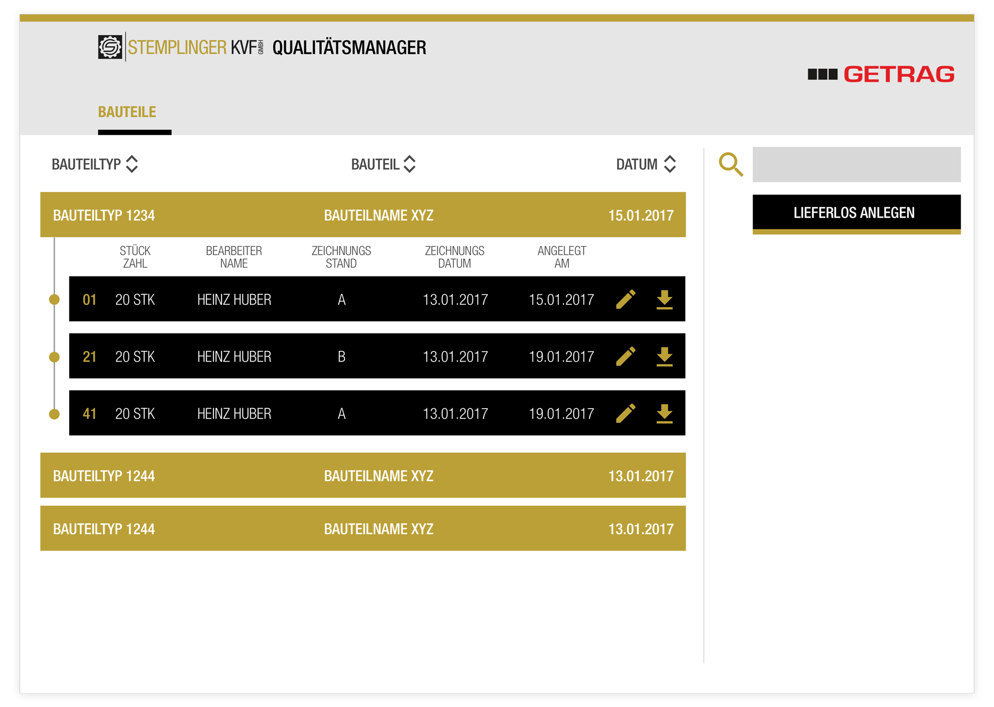
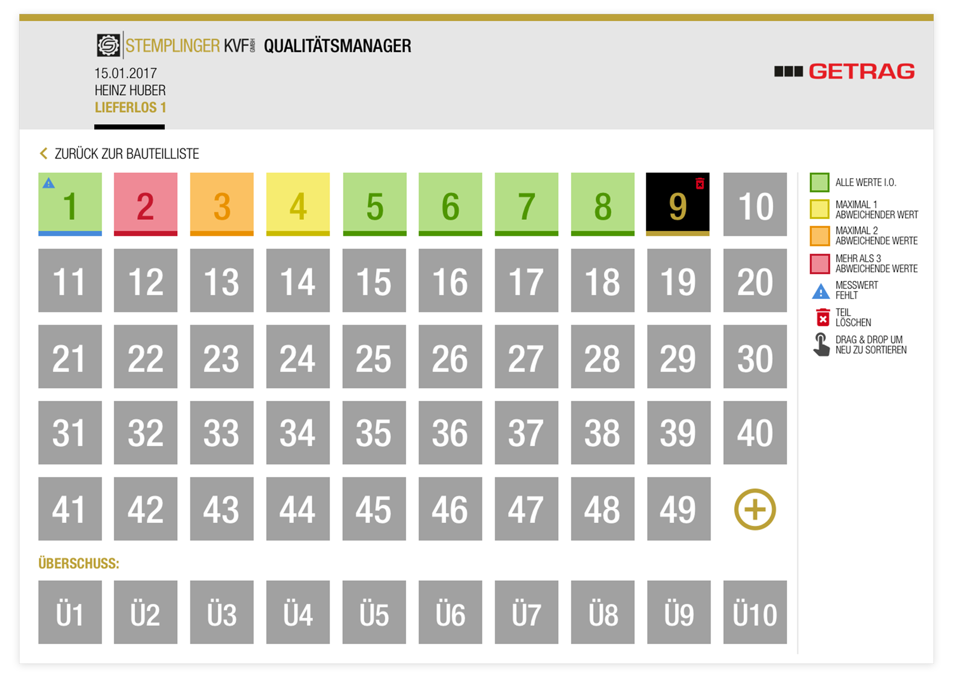
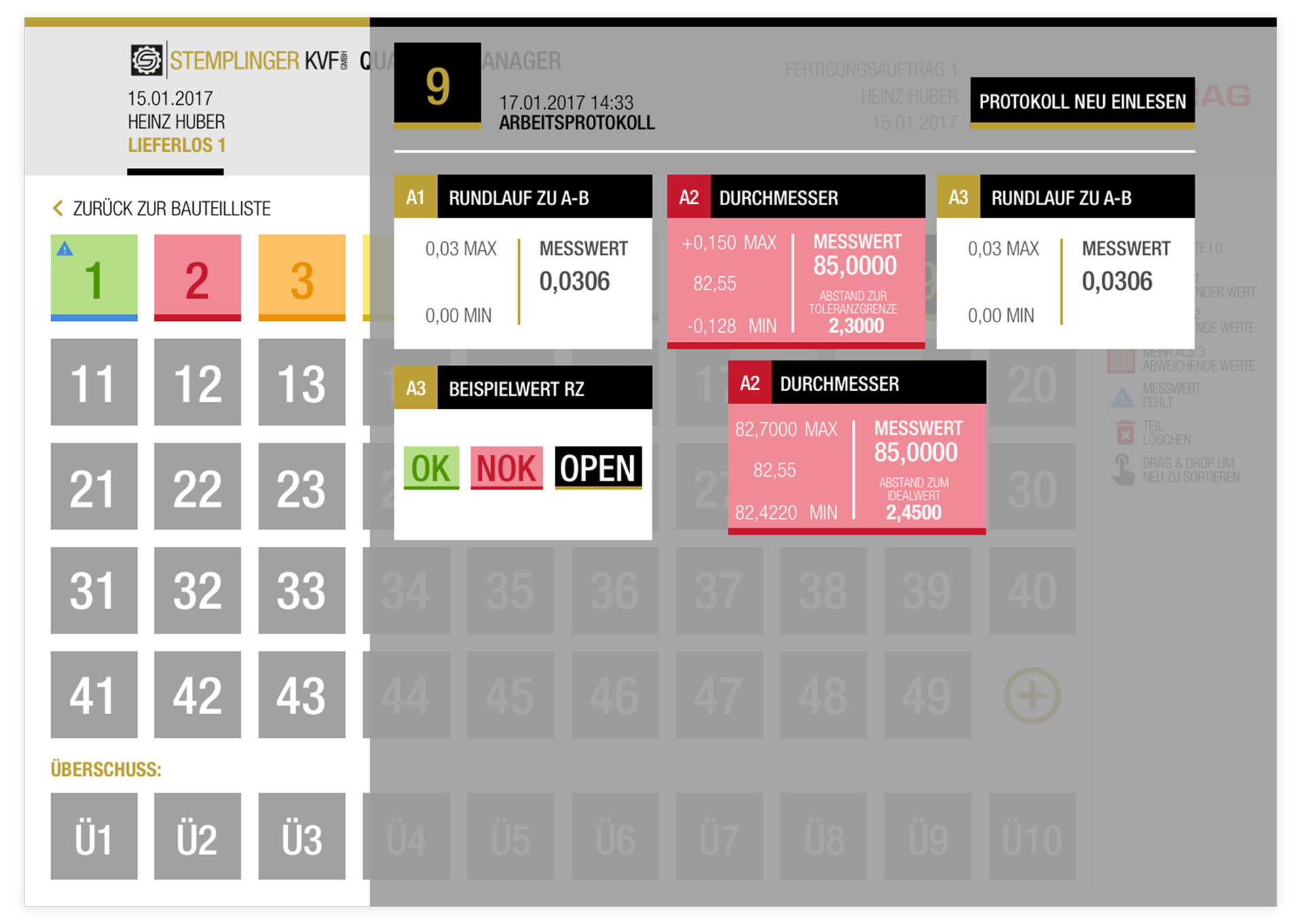
We optimized the process of how measurements of a measured component are displayed. Before the implementation of our system, the workers worked with excel sheets – and were prone for for failure by overlooking wrong values (which resulted in a lot of excess waste of material and time).
To solve this problem, I thought about a first crash of a Space Ship in the USA: engineers worked with excel sheets which showed them the heat values of certain areas and they did not notice a single value that was far too high – if the values were displayed differently, this disaster wouldn’t have happened.
Thus a very graphic way to recognize wrong values was very important in this project.
MY ROLE
Concept, UX, UI
DATE
2017